We recently met with Gillian and her husband John (our 2016 Room Makeover Giveaway Winners) to reveal our design plan! We showed them two different ways of using the same sofa, accent chairs and media console. What differentiates the two palettes is the rug, ottoman and upholstery selections.
THE CLASSIC MOD PALETTE
Light, warm + handsome
THE STORMY MOD PALETTE
Dark, moody + playful
THE CORE FURNISHINGS
As you can see from the floorplans, we changed things around! A sofa and pair of chairs replace their sofa chaise and sentimental chair (which we recommended they move to another space). We pivoted the furnishings 90 degrees counter clockwise. The seating arrangement focuses on a new large media console and central ottoman/coffee table. The sofa, chairs and media console set the aesthetic tone for the room because of their scale. We picked these pieces because of how they compliment Gillian and John's Mid Century Modern home + design taste:
ADDITIONAL FURNITURE + GALLERY WALL
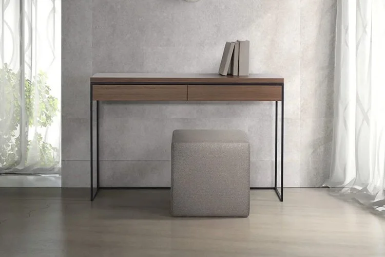
To create a welcoming and functional landing zone in their entryway, we suggested a gallery wall of their existing artwork with a new console table, table lamp and pair of stools beneath it. We understood why they're fond of the vertical blinds and suggested they simply update them with a more modern design.
After our presentation, Gillian shared in an email that “it was great coming in and seeing the design you put together for our front room! There are a lot of good options to think about, and how they work with our lifestyle”. We’ll be hearing from them soon about which direction they want to go and will update you on their final selections!
Do you like our solutions for Gillian + John? If so, let us know by clicking the little heart at the bottom right of this blog post!


